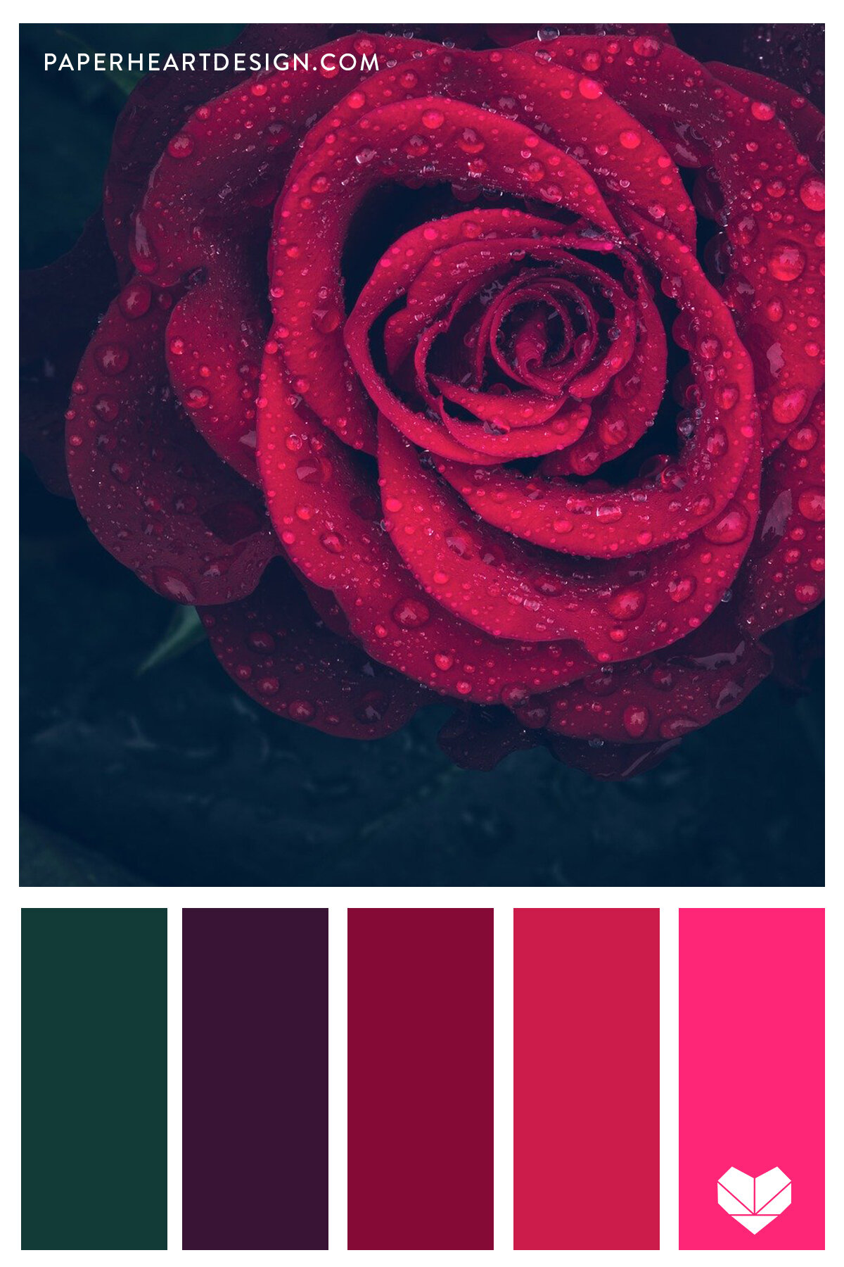
Dark crimson is a deep, rich red hue that evokes elegance and intensity. To select perfect color combinations for your project, leverage color theory principles for harmonious visual impact.
Principles for Harmonious Pairings
Understand core rules for compatibility. Complementary colors create high contrast; pair dark crimson with analogous greens like deep emerald for balance. Analogous schemes blend smoothly with adjacent hues such as burgundy or ruby. Aim for a 60-30-10 ratio in usage to avoid overwhelming designs.
Recommended Color Combinations
- Dark Crimson + Gold: Adds luxury and warmth; ideal for branding and high-end products.
- Dark Crimson + Slate Gray: Provides neutral grounding; perfect for modern websites or apps.
- Dark Crimson + Navy Blue: Creates classic sophistication; suits corporate presentations or packaging.
- Dark Crimson + Cream: Softens intensity; works for invitations or editorial layouts.
Practical Application Tips
Test combinations in mockups using digital tools. Consider context: avoid clashing in busy interfaces, and ensure accessibility by checking contrast ratios for readability. For seasonal projects, pair with muted tones like olive green for versatility.