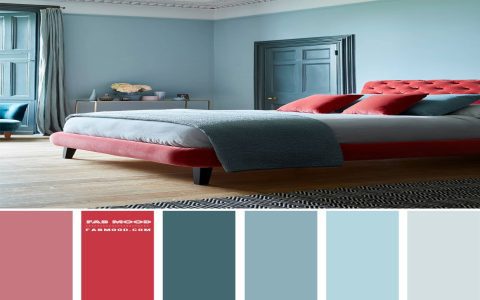
Combining red and crimson leverages their shared warm undertones while creating visual distinction. This pairing delivers high-impact contrast through subtle variations in saturation and brightness, proving effective across design disciplines.
Color Theory Foundations
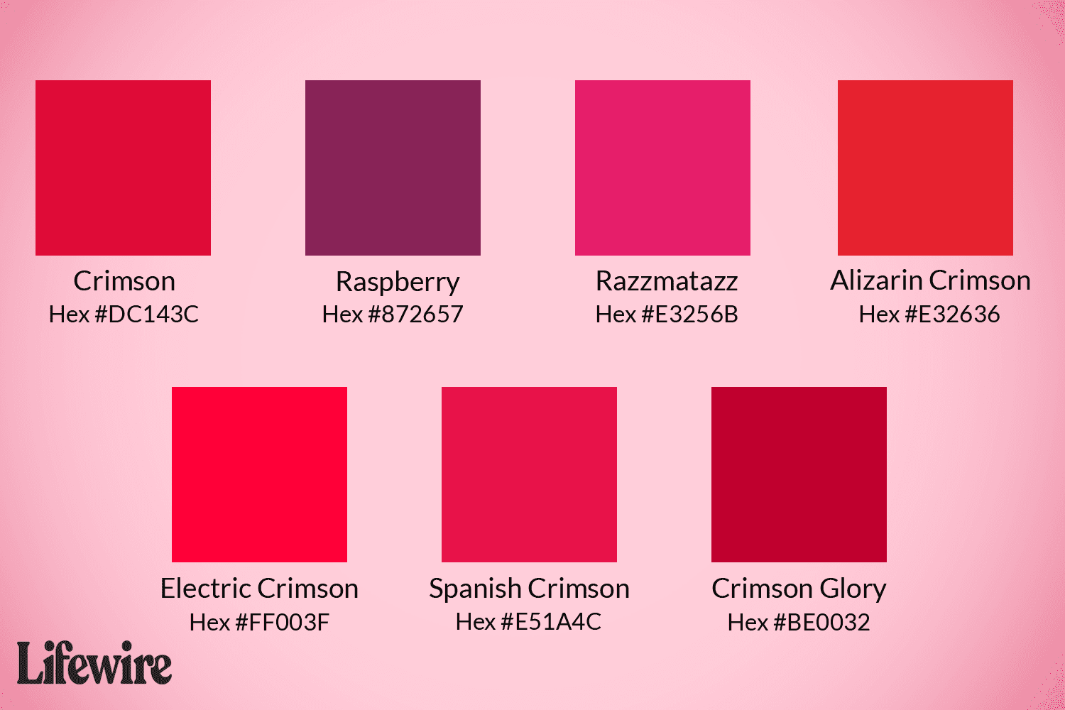
Red (#FF0000) embodies pure vibrancy and urgency. Crimson (#DC143C), a deeper red with blue undertones, adds sophistication and richness. Together, they create:
- Dynamic Contrast: High luminosity difference grabs attention without clashing.
- Visual Depth: Crimson recedes slightly, making pure red elements "pop" forward.
- Tonal Harmony: Shared warm base ensures cohesion despite contrast.
Professional Application Examples
Brand Identity: Luxury fashion brands use crimson for primary logos with vivid red accents in seasonal campaigns—crimson conveys heritage, red injects modernity.
Digital Interfaces: Critical alerts (red) appear against crimson backgrounds in dashboards. This hierarchy reduces user cognitive load while maintaining severity.
Editorial Design: Magazine spreads pair crimson text headers with red pull-quotes or data visualizations, guiding readers through content tiers.
Packaging: Limited-edition products feature crimson outer boxes with bold red typography. The combination signals premium exclusivity while ensuring shelf visibility.
Best Practices
- Balance Dominance: Use red sparingly for focal points (15-20% of composition).
- Contextual Adjustments: Increase crimson's saturation in digital applications to compensate for screen glare.
- Neutral Anchoring: Ground vibrant pairings with charcoal, cream, or deep navy to prevent visual fatigue.
- Accessibility: Maintain minimum 4.5:1 contrast ratio against backgrounds; avoid pairing in text/background combinations.
This strategic color duo harnesses red's immediacy and crimson's depth, making it exceptionally versatile for creating sophisticated yet attention-commanding visual communications.